


.png)


.png)
How to Use Quill Rich Text Editor in React JS | 2024
Read More

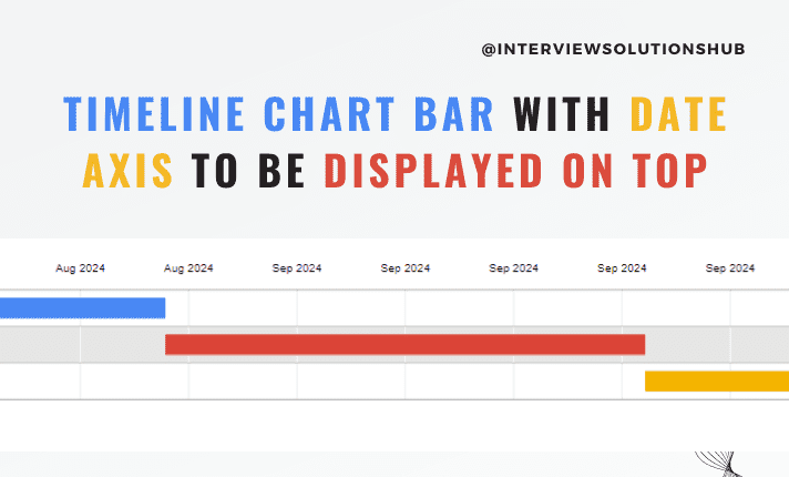
Google Visualization Charts are a flexible tool for displaying timelines; however, you may occasionally need to modify the chart's layout to improve readability and presentation. This detailed tutorial will help you to align the date axis and timeline chart bar at the top of your chart.

First, include the Google Charts library in your HTML document. This script tag in the <head> section is essential for loading the necessary components.
<head>
  <script type="text/javascript" src="https://www.gstatic.com/charts/loader.js"></script>
</head>
Create a `<div>` element where the chart will be rendered. Make sure it has a defined height for proper display.
<body>
  <div id="timeline" style="height: 180px;"></div>
</body>
Write the JavaScript function to initialize and draw your timeline chart. Here’s an example of how to set up the chart with the date axis positioned at the top.
<script type="text/javascript">
  google.charts.load('current', {'packages':['timeline']});
  google.charts.setOnLoadCallback(drawChart);

  function drawChart() {
    var container = document.getElementById('timeline');
    var chart = new google.visualization.Timeline(container);
    var dataTable = new google.visualization.DataTable();

    dataTable.addColumn({ type: 'string', id: 'Event' });
    dataTable.addColumn({ type: 'date', id: 'Start' });
    dataTable.addColumn({ type: 'date', id: 'End' });

    // Example data
    dataTable.addRows([
      [ 'Event 1', new Date(), new Date(new Date().setMonth(new Date().getMonth() + 1)) ],
      [ 'Event 2', new Date(new Date().setMonth(new Date().getMonth() + 1)), new Date(new Date().setMonth(new Date().getMonth() + 2)) ],
      [ 'Event 3', new Date(new Date().setMonth(new Date().getMonth() + 2)), new Date(new Date().setMonth(new Date().getMonth() + 3)) ]
    ]);

    // Calculate today and the end date (e.g., 3 months from today)
    var today = new Date();
    var endDate = new Date();
    endDate.setMonth(today.getMonth() + 3);

    var options = {
      timeline: {
        showRowLabels: false
      },
      avoidOverlappingGridLines: false,
      hAxis: {
        format: 'MMM yyyy', // Display months and years
        gridlines: {
          count: -1
        },
        minValue: today, // Start from today
        maxValue: endDate // End date
      },
      chartArea: {
        width: '90%',
        height: '80%'
      }
    };

    function afterDraw() {
      var svg = document.getElementsByTagName("svg")[0];
      var g = svg.getElementsByTagName("g")[1];
      svg.style.overflow = 'visible';
      svg.parentNode.style.top = '45px';
      var height = Number(g.getElementsByTagName("text")[0].getAttribute('y')) + 20;
      g.setAttribute('transform', 'translate(0, -' + height + ')');
    }

    function resizeChart() {
      chart.draw(dataTable, options);
      afterDraw();
    }

    window.addEventListener('resize', resizeChart);
    resizeChart(); // Initial draw
  }
</script>
google.charts.load and google.charts.setOnLoadCallback: These functions load the Google Charts library and set the callback function to draw the chart once the library is ready.
dataTable.addRowsFill in the chart with your data. Each row represents an event with a start and end date.
options Object:
timeline.showRowLabels: Hides row labels for a cleaner look.avoidOverlappingGridLines: Prevents overlapping of grid lines.hAxis.format: Sets the format of the date axis to display months and years.hAxis.minValue and hAxis.maxValue: Defines the start and end of the timeline, starting from today and extending to 3 months from today.chartArea.width and chartArea.height: Adjusts the chart's area to fit within the container.afterDraw Function:
resizeChart Function:
afterDraw adjustments when the window is resized.window.addEventListener('resize', resizeChart): Ensures the chart is responsive and maintains the correct layout when the window size changes.
This tutorial assists you in positioning the date axis and timeline chart bar at the top of your Google Visualization Chart. You can alter the chart's appearance to suit your requirements by modifying its settings and applying dynamic date calculations. This configuration makes sure your data is presented efficiently and clearly, whether you are showcasing project timelines or historical events.
Feel free to adjust the minValue and maxValue to fit the specific range of dates relevant to your data, and customize the format of the hAxis to suit your preferences.

Greetings, I'm a passionate full-stack developer and entrepreneur. I specialize in PHP, Laravel, React.js, Node.js, JavaScript, and Python. I own interviewsolutionshub.com, where I share tech tutorials, tips, and interview questions. I'm a firm believer in hard work and consistency. Welcome to interviewsolutionshub.com, your source for tech insights and career guidance.
Recent posts form our Blog
.png)
.png)


.png)
0 Comments
Like 0